Analysing Photograph Edits
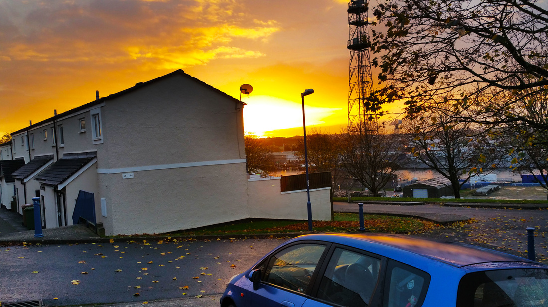
This is the best photograph that I believe I took and edited for my first shoot. To make sure the sunset was very obvious I made the vibrance high as well as the contrast - however I dimmed down the brightness to make it stand out. Although I really wanted the clouds to appear much darker as they are so I created a background copy and used the burn tool all around the top left of this photograph. I also used the dodge tool to brighten the reflection of the sun on the car roof. This image is highly liked by me because it gives the emotion of peacefulness and relaxation. This image relates to the project - street photography, because there are many aspects of the street in the image. Such as cars, houses, tree's as well as the city in the far background.
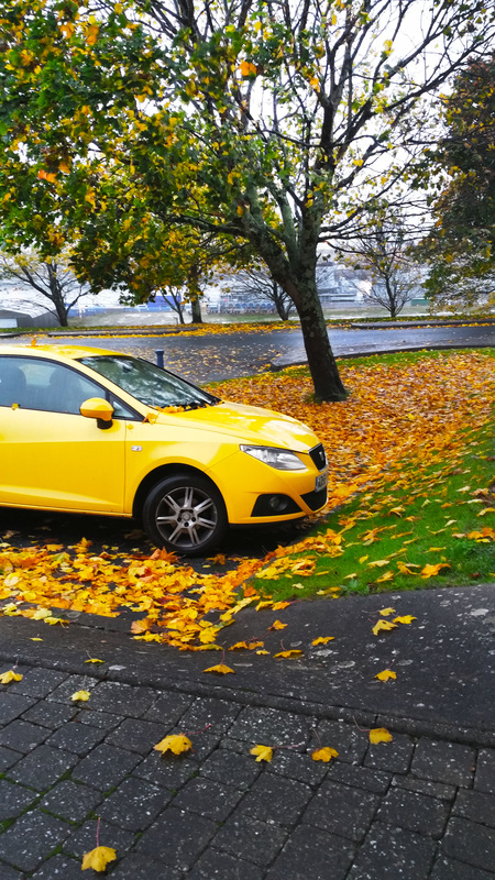
For this photograph I really brightened things up to make it lively and vibrant. To create this image I used brightness, vibrance, curves as well as creating a background copy to use mostly dodge -however some parts of this photograph was made with the burn tool. Brightness vibrance and curves were all used to create the perfect brightness of this image - and to make the colours of the leaves tree's and the car to stand out. I feel this photograph really relates to street photography by showing the brighter side of a street - it gives off the emotion of happiness and life (with all the leaves and tree's). I kept the colour in this photograph because I felt that because the car was yellow - and since I can make it much brighter it could help express the feelings that come from this photograph.
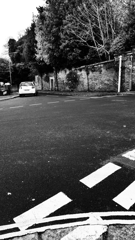
I decided to make some of my images in black and white to relate back to the research I did of Robert Frank. This is one of my favourite edits I did in black and white. To create this image I used curves to make it darker. I then put contrast to the highest to show the detail of the tree's and walls as well as to age the image a bit. However I also used the dodge tool to brighten up the leaves on the tree. To create the black and white effect I used gradient. I really believe this photo relates to street photography in particular Robert Frank because of the objects you'd find in every street.
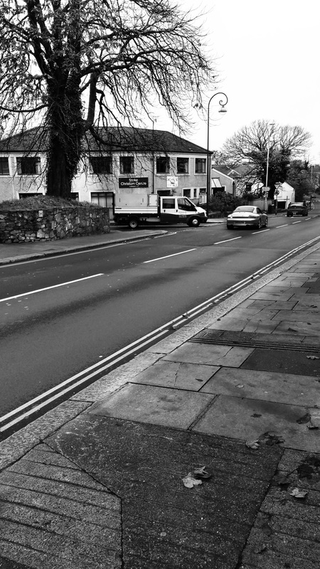
This edit was one I really enjoyed creating - I like how it's black and white rather than in colour because you can clearly see the different shades of grey along the pavement. I used curves to brighten this image up - this way you can clearly see the tree's. Next I made the contrast to it's fullest, this made the branches of the tree's and the little details of the pavement and road stand out more. What made the photograph come together for me is the way I used the burn tool on the pavement - darkening the images really made the shades blend well together. I love how this photograph can relate to street photography - this is more about the small details such as the cracks or the smudges and the bricks.
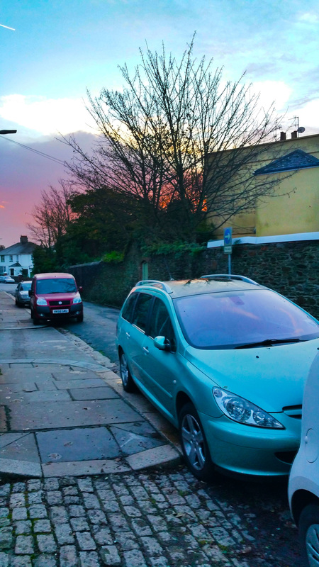
I really like this edit I did, the selection I favourite the most is the different colours in the sky. This picture just feels like it shouts 'street photography' it has all the aspects from cars to tree's and houses. To make sure the sky really stands out in this edit I used vibrance to heighten the colours. I also used curves to lighten the image as well as contrast. The next tool I used was the dodge tool, it was used a lot on this photograph to make sure that you can clearly see the difference in colours and detail. Also to brighten up the cars and pavement so it blends well with the brightness of the sky.
